Boost Your Website Speed Using This Tips
Good speed of your website get maximum page views, attract customer, user satisfaction and conversions.
Minimize HTTP Requests
80% of a Web page’s load time is spent downloading the different pieces-parts of the page: images, stylesheets, scripts, Flash, etc.
That being the case, the quickest way to improve site speed is to simplify your design.
Minimize HTTP Requests
80% of a Web page’s load time is spent downloading the different pieces-parts of the page: images, stylesheets, scripts, Flash, etc.
That being the case, the quickest way to improve site speed is to simplify your design.
- Streamline the number of elements on your page.
- Use CSS instead of images whenever possible.
- Combine multiple style sheets into one.
- Reduce scripts and put them at the bottom of the page.
Reduce Server Response Time
Your target is a server response time of less than 200ms (milliseconds). And if you follow the tips in this article, you’re well on your way to achieving this.
Enable Gzip Compression
Large pages are often 100kb and more. As a result, they’re bulky and slow to download.
Compression reduces the bandwidth of your pages, thereby reducing HTTP response. You do this with a tool called Gzip.
And since 90% of today’s Internet traffic travels through browsers that support Gzip, it’s a great option for speeding up your site.
Gzipping reduces the size of the HTTP response and helps to reduce response time. It's an easy way to reduce page weight.
You can enable it by adding the following code to your .htaccess file:
# compress text, html, javascript, css, xml:
AddOutputFilterByType DEFLATE text/plain
AddOutputFilterByType DEFLATE text/html
AddOutputFilterByType DEFLATE text/xml
AddOutputFilterByType DEFLATE text/css
AddOutputFilterByType DEFLATE application/xml
AddOutputFilterByType DEFLATE application/xhtml+xml
AddOutputFilterByType DEFLATE application/rss+xml
AddOutputFilterByType DEFLATE application/javascript
AddOutputFilterByType DEFLATE application/x-javascript
# Or, compress certain file types by extension:
<files *.html>
SetOutputFilter DEFLATE
</files>
Or, use the following PHP code at the top of your HTML/PHP file:
<?php if (substr_count($_SERVER['HTTP_ACCEPT_ENCODING'], 'gzip')) ob_start("ob_gzhandler"); else ob_start(); ?>
Enable Browser Caching
When you visit a website, the elements on the page you visit are stored on your hard drive in a cache, or temporary storage, so the next time you visit the site, your browser can load the page without having to send another HTTP request to the server.
The first time someone comes to your website, they have to download the HTML document, stylesheets, javascript files and images before being able to use your page. That may be as many as 30 components and 2.4 seconds.
Once the page has been loaded and the different components stored in the user’s cache, only a few components needs to be downloaded for subsequent visits.
Optimize images
With images, you need to focus on three things: size, format and the src attribute.
Image size
Oversized images take longer to load, so it’s important that you keep your images as small as possible. Use image editing tools to:
- Crop your images to the correct size. For instance, if your page is 570px wide, resize the image to that width. Don’t just upload a 2000px-wide image and set the width parameter (width=”570”). This slows your page load time and creates a bad user experience.
- Reduce color depth to the lowest acceptable level.
- Remove image comments.
Image format
- JPEG is your best option.
- PNG is also good, though older browsers may not fully support it.
- GIFs should only be used for small or simple graphics (less than 10×10 pixels, or a color palette of 3 or fewer colors) and for animated images.
- Do not use BMPs or TIFFs.
Src attribute
Once you’ve got the size and format right, make sure the code is right too. In particular, avoid empty image src codes.
In HTML, the code for an image includes this:
<img src=””>
When there’s no source in the quotation marks, the browser makes a request to the directory of the page or to the actual page itself. This can add unnecessary traffic to your servers and even corrupt user data.
Optimize CSS Delivery
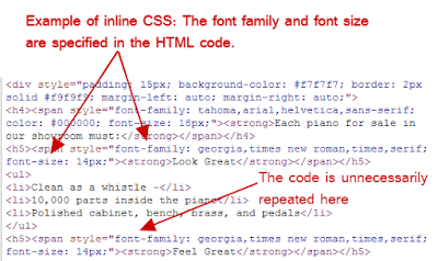
CSS holds the style requirements for your page. Generally, your website accesses this information in one of two ways: in an external file, which loads before your page renders, and inline, which is inserted in the HTML document itself.
The external CSS is loaded in the head of your HTML with code that looks something like this:
<!—Your styles –>
<link rel=”stylesheet” type=”text/css” media=”all” href=http://yourURL/style.css />
Inline CSS is nested in your page’s HTML and looks like this:
In general, an external style sheet is preferable, because it reduces the size of your code and creates fewer code duplications.
Pro Tip: When setting up your styles, only use one external CSS stylesheet since additional stylesheets increase HTTP requests. Here are a two resources that can help:
- CSS Delivery Tool – Tells you how many external stylesheets your website is using.
- Instructions for combining external CSS files.
Reduce the number of plugins you use on your site
Too many plugins slow your site, create security issues, and often cause crashes and other technical difficulties.
Pro Tip: Deactivate and delete any unnecessary plugins. Then weed out any plugins that slow your site speed.
Try selectively disabling plugins, then measuring server performance. This way you can identify any plugins that harm your site speed.
Reduce redirects
Redirects create additional HTTP requests and increase load time. So you want to keep them to a minimum.
If you’ve created a responsive website, more than likely, you have redirects in place to take mobile users from your main website to the responsive version.
Pro Tip: Google recommends these two actions to make sure a responsive redirect doesn’t slow your site:
- Use a HTTP redirect to send users with mobile user agents directly to the mobile equivalent URL without any intermediate redirects, and
- Include the <link rel=”alternate”> markup in your desktop pages to identify the mobile equivalent URL so Googlebot can discover your mobile pages.
Sound too technical? Don’t worry. This post by VerveSearch helps you navigate your switch to a mobile-friendly website without compromising speed.


Comments
Post a Comment